Briki is an independent speciality coffee shop located in the heart of London’s vibrant Exmouth Market. With a focus on high-quality coffee and a welcoming atmosphere, the coffeeshop has established itself as both a beloved local café and a cultural hub for London’s Greek community.

In partnership with Area 51, Briki serves expertly crafted coffees prepared by award-winning baristas, alongside freshly baked filo pastries, small plates, and a selection of cakes and desserts.

The business approached me to formalise and elevate their existing brand, redesign and enhance their website, implement a user-friendly digital menu, and lead a range of customer experience initiatives. This comprehensive brand and digital development aimed to strengthen their identity, streamline operations, and enhance customer engagement both online and in-store particularly as they look to expand into a second location.
Brand DevelopmentWebsite
·
·
AI Image Generation
·
Table Cards & QR Codes
·
Gift Cards
·
Google My BusinessConclusion
Brand Development

Identity & Mission

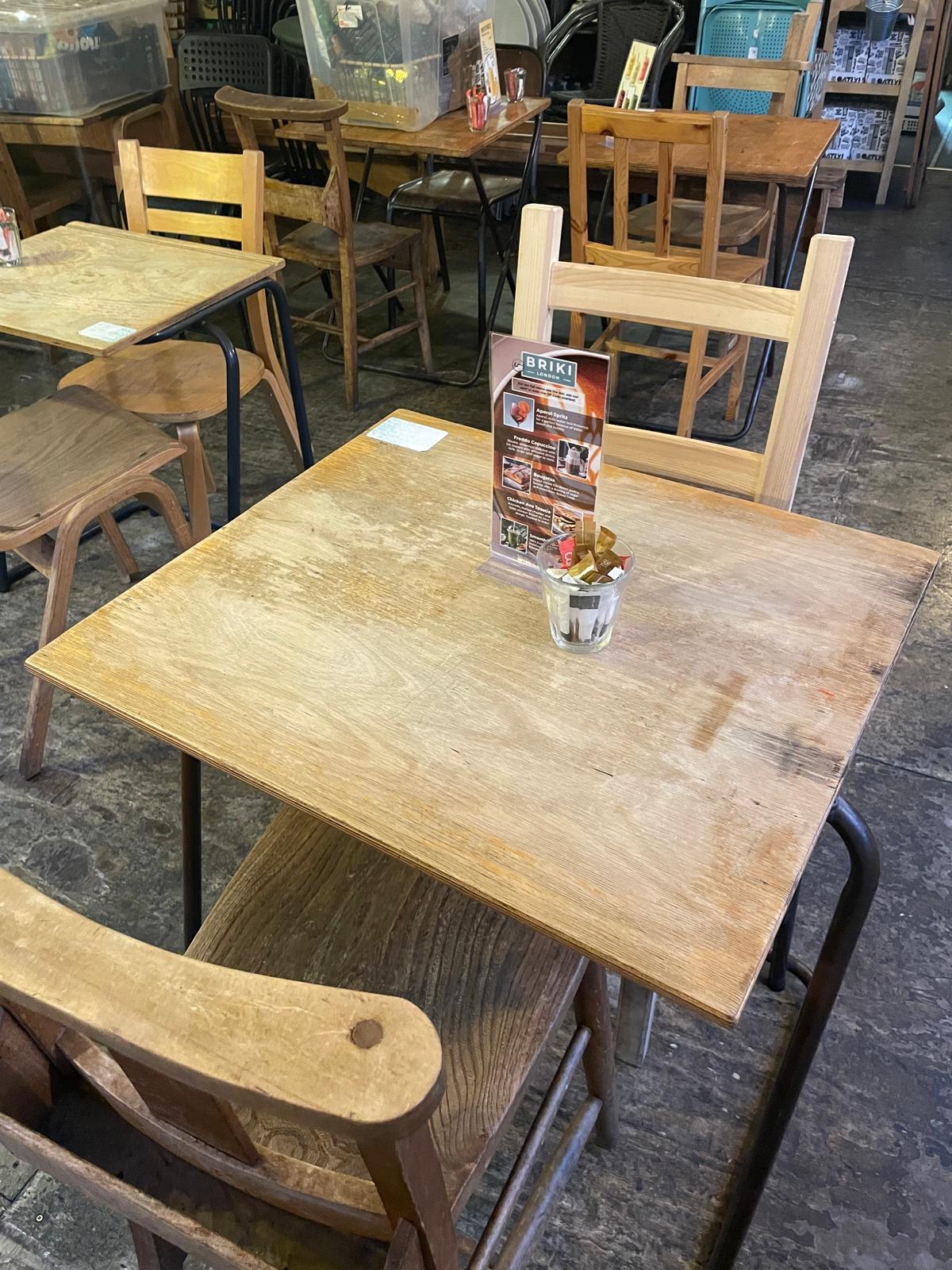
Briki’s brand is built on the principles of warmth, authenticity, and quality. The café’s inviting space, featuring old-school wooden tables and chairs, lush greenery, and a carefully curated selection of Greek treats, reflects its commitment to a cosy yet refined aesthetic. The coffee is carefully curated and quality tested throughout the day with a large part of the Barista training process instilling an appreciation for the craft and the high standards that come with specialty coffee. Moreover, the environment fosters a sense of community, making it a place where both regulars and newcomers feel at home.

Briki’s brand identity was already strong in concept but required standardization and scalability to ensure consistency across digital and physical touchpoints. The brand evolution focused on refining its core elements while maintaining its warm, independent, and community-driven appeal.

Identifying the Need

Before development, Briki had a website that didn’t work very well, was outdated and in many respects unprofessional. As well as the desire to have a clean and professional digital presence for people looking up the shop online we recognised many customers asked for a menu and that the website could help us cover that goal too with a digital, mobile-friendly menu.

Briki’s branding lacked formal guidelines and scalability, leading to inconsistencies in application. Indeed, customers would often ask staff in store what the name of the shop was and what are main products were. While the original logo was recognizable and effective, it needed refinement for versatility across different formats, from print to digital

Strategic Enhancements

Logo Refinement: Standardizing and upscaling the existing briki pot icon to ensure cleaner reproduction across all media.

Badge: Introducing a compact “Briki London” badge for branding flexibility, used on digital materials, packaging, and signage.

Consistent Visual Identity

Establishing clear typography, color palette, and layout principles to unify the brand experience across digital and physical formats.

Implementation

The refined branding was systematically applied to Briki’s website, packaging, signage, and digital marketing materials, ensuring cohesion and recognizability across all customer touchpoints. The logo and badge were incorporated into merchandise, table cards, loyalty cards, and social media assets, strengthening brand awareness while retaining the organic, friendly character that makes Briki unique.

Brand Strategy & Positioning Analysis

Target Audience

Briki’s audience can be divided into two key demographics:

  • Local Residents & Professionals: Individuals who live or work in Exmouth Market and appreciate high-quality coffee in a friendly, well-designed space. Customers drawn to the café’s relaxed yet professional service, ideal for casual meetings, remote work, or unwinding.
  • London’s Greek Community: A dedicated group who travel from across London to visit Briki as a cultural gathering space. This audience primarily visits on weekends, transforming the café into a bustling hub where Greek is commonly spoken, traditional games like Tichu are played, and an authentic Mediterranean social atmosphere emerges.

Briki’s ability to balance cultural authenticity with broad accessibility is central to its success. While it serves as a touchpoint for Greek culture, the branding and experience are inclusive, ensuring that all customers, regardless of background, feel welcomed and engaged.

Brand Personality & Customer Experience

Briki’s brand tone is friendly, calm, and unpretentious, embodying the warmth of Mediterranean hospitality while maintaining the refined quality expected of a top-tier coffee shop. Unlike the more formal or overly polished service styles found in larger chains, Briki’s team fosters a genuine, relaxed atmosphere. The staff deliver service that is:

  • Casual yet professional – prioritizing quality over quantity.
  • Warm and welcoming – exuding a natural friendliness, without the overly scripted politeness typical of some English or American service models.
  • Rooted in pride and craftsmanship – reflecting a commitment to delivering an exceptional coffee experience.

Key Differentiators

Briki stands apart from competitors in Exmouth Market through its dual identity:

  • A high-quality speciality coffee shop – First and foremost, Briki is a destination for expertly crafted coffee, ensuring it appeals to both casual visitors and coffee connoisseurs.
  • A Greek cultural hub – Without being overtly themed, Briki naturally integrates elements of Greek culture, making it an authentic space for the Greek community while remaining approachable to all customers.

On weekends, the café transforms into an immersive experience where Greek language, customs, and traditions create an atmosphere reminiscent of a neighbourhood café in Greece. Yet, for those who simply seek great coffee and a relaxed environment, Briki remains an accessible and inviting space throughout the week.

Logo & Visual Identity

Logo Standardisation & Application

As part of my work with Briki I developed a comprehensive brand package, including a structured set of logo usage guidelines to maintain a consistent and recognizable brand presence.

Briki’s logo is a simple yet highly effective mark, an abstract curved line forming the shape of a traditional briki pot (a small copper vessel used for brewing Greek coffee). This minimalistic design is clean, versatile, and instantly recognizable, making it a strong visual asset across both physical and digital applications.

As part of the brand development process, I standardized and upscaled the logo to ensure consistency in resolution, proportions, and clarity across all branded materials. This included preparing high-quality vector files suitable for various print and digital media, ensuring the logo retains its sharpness and impact whether displayed on a tote bag, coffee cup, signage, or online platform.

Brand Colour Palette

Briki’s colour identity is rooted in simplicity and harmony, aligning with the shop’s warm, organic aesthetic:

  • Primary Colour: The primary brand colour, Sea Nymph (#7fa99f), is a soft, neutral sea green. I chose it as it evokes a sense of calm and understated sophistication, complementing the earthy browns of coffee tones and reinforcing Briki’s connection to high-quality, artisanal coffee. This colour is used subtly yet effectively across digital branding, including the website and social media, as well as a tasteful accent within the physical café space, highlighted by a single feature wall.
  • Natural Complements: Earthy blacks and browns derived from coffee tones, ensuring the branding feels organic and connected to the product.
  • Material Considerations: While the sea green works beautifully as an accent colour, I advised against using it for coffee cups, as a clean, soft paper white or black better complements the brand’s sustainability ethos and the warm, earthy aesthetic of the café’s ceramics and recycled materials.

Typography & Branding Elements

Typography plays a crucial role in Briki’s brand presence, balancing modern elegance with a clean, approachable feel:

  • Typeface: Montserrat – chosen for its stylish, clean, and contemporary qualities.
  • Hierarchy:
    • Headings – Extra bold and strong, reinforcing brand confidence and clarity.
    • Body Text – Regular weight, ensuring easy readability across digital and print applications.
The Briki Website
Briki had a domain, but their existing site was outdated, glitchy, and unprofessional. They wanted a new online platform to showcase essential information like opening times, coffee suppliers, and shop offerings and the shop menu, while reflecting the shops culture.

Specifications for the site were developed with the staff and owner, and included:

Mobile First Design
Ease Of Use
Digital Menu
Specialty Coffee Promotion
Shop Culture Integration
A Customer Feedback Form

These are all expanded on in further sections below.

Results:
After launching the website, we saw an increase in customer engagement, with more visitors using the digital menu and providing feedback via the site.

Customers regularly use the site in store, ordering with the help of the digital menu and with more customers asking for products highlighted on the digital menu.

See the live site here:
Briki-London.co.uk
Mobile First & Ease of Use
Customers would be accessing the website primarily through their phones. Reasons for this include the site being linked through the shop's social media, as a primary use case amongst the shop's target market and especially as it would be accessible through QR codes throughout the shop.

The first design principle was ensuring that customers would be able to quickly, easily, and enjoyably find what they were looking for. This meant extensive user testing to avoid many of the finicky pitfalls that can come with digital mobile menus.
Digital Menu
The shop has a very wide range of offerings and customers regularly asked for menus, the only menu being several boards behind the counter.

Physical table menus would take up too much space on the small tables in the store and are cumbersome to update, a particular problem with the coffee shops dynamic offerings.

We opted to include a digital menu on the site and to make it QR accessible from the tables throughout the shop. This part of the site additionally needed to be easily updatable due to fluctuating prices and new offerings.
Product Showcase
Briki wanted to celebrate the quality of their coffee; widely sourced speciality beans, roasted in Athens and brewed by the expert baristas on staff.

This meant liaising with the supplier Area 51 Coffee to produce and direct professional photography of their product in our shop, backlinking our sites and aligning the brand voices.

Just as in store, the site has a dedicated area showcasing our speciality suppliers.  
Shop Culture
Part of the shop experience includes “Dogs of Briki”. Being a dog friendly cafe and with a “dog photo wall” with photos of all of the regular customers' pets, many of whom frequent the shop to enjoy a doggie treat.

We wanted to bring this into the digital experience through a customer photo upload portal. The specifications being that is free and extremely easy to use both on the customer and management side.

We also wanted to highlight some other offerings that weren’t on the Food and Drink menu such as Greek Imports, Briki Merchandise and the Briki Gift Project all of which can be found on the site homepage.
Customer Feedback Form
Customers did not have a way to provide feedback outside of speaking directly to staff and so I suggested including a feedback form to allow customers to provide collatable and actionable information to help improve the shop's offerings.

We knew customers often asked for things that the shop did not offer (such as dairy free whipped cream and flavoured syrups), a form would help us see this data clearly and identify opportunities.
AI Image Generation
Hiring a professional photographer for food and product photography did not fit our budget, and so I used my skills with AI image generation to create product photos to use on the site and table cards.

AI tools include Adobe Firefly and Open AI's Dall-E 3.

The images below are examples of original AI generated images created for this client. Please note effort has been taken to match productware, real presentation and shop aesthetics.
Table Cards & QR Codes
The shop had a number of table cards cluttering the tables from their various suppliers.

To declutter the shop’s tables and strengthen Briki’s in-store brand presence, I designed table cards featuring shop offerings, culture highlights, and QR code links. These cards allowed customers to engage with the brand, access the digital menu, and learn more about the café without overwhelming the small tables.

Menu-linked QR codes have additionally been placed by the counter and on tables throughout the shop for ease of access.
An early draft design, this design aimed to be fun, eye-catching and endearing.

However the client wanted something much simpler, less colourful and with less of a "cartoon" aesthetic.
The final designs looked like this, with a more standardised design language and understated aesthetic.
Gift Cards
Customers frequently asked about gift cards, especially during the holiday season. I led the design and implementation of the Briki Gift Card Project with a focus on simplicity and cost-effectiveness. We opted for physical, single-use paper cards rather than a digital system, as it was more practical for Briki’s size.
Homelessness is a visible problem around Kings Cross and Exmouth Market the idea was born to "Pay It Forward".

As people buy their coffee and lunch they could “Pay It Forward” by purchasing a single-use paper £5 gift card to then give to someone in need to use for a coffee and a bite to eat.

Any unspent funds on the card are donated to the homelessness and housing charity Shelter.
The back of the gift cards aimed to explain how the project worked as simply as possible, both to staff and customers, while facilitating their function as both gift cards and charity donations.
Card designs featured artwork created for the shop as well as personal art by yours truly.

Specifications being that they are fun, unique and eye-catching.

Full design gallery below.
The gift card project was a success, with customers embracing the Pay It Forward initiative. Over the holiday season, we sold over 200 gift cards, contributing not only to Briki’s sales but also to the community through donations to Shelter.

To date the project has raised several hundred pounds for charity.
Google My Business
Briki has a fantastic Google Review presence, with over one thousand reviews and an average of 4.4 stars. However the Google My Business page was unclaimed, with missing information, unlinked to a website and nobody keeping track of the reviews.

As part of my work helping to develop the brand's digital presence I claimed, updated and started helping management keep track of the Briki Google My Business page.  
Google Review Management meant bringing the odd review that did not entirely appreciate the experience to the attention of the client.

I also helped quickly and professionally reply from the official account to help resolve and understand any issues customers were facing.

One major issue I noticed coming up across poorer reviews was staff coming across as rude. While this could be considered a bit of a culture clash (Greek culture and language arguably being more direct than British) it was highly appreciated by management.
Conclusion
My work with Briki improved both their digital and physical presence, laying the foundation for their expansion into a second location. By creating a customer-centric, scalable brand rooted in Briki’s unique culture, I helped establish a professional image while maintaining community spirit.

Focusing on both the digital and in-store experience, we developed a cohesive brand presence, from a mobile-first website and digital menu to initiatives like “Pay It Forward” gift cards and interactive table cards. These efforts not only solved operational challenges but also set the stage for long-term brand consistency and customer loyalty.

By blending creativity with practicality, I delivered innovative solutions, including AI-generated imagery and budget-friendly gift card systems. The measurable impact, such as increased web traffic and stronger customer engagement, highlights how a strategic approach to brand and digital development can drive growth and loyalty.