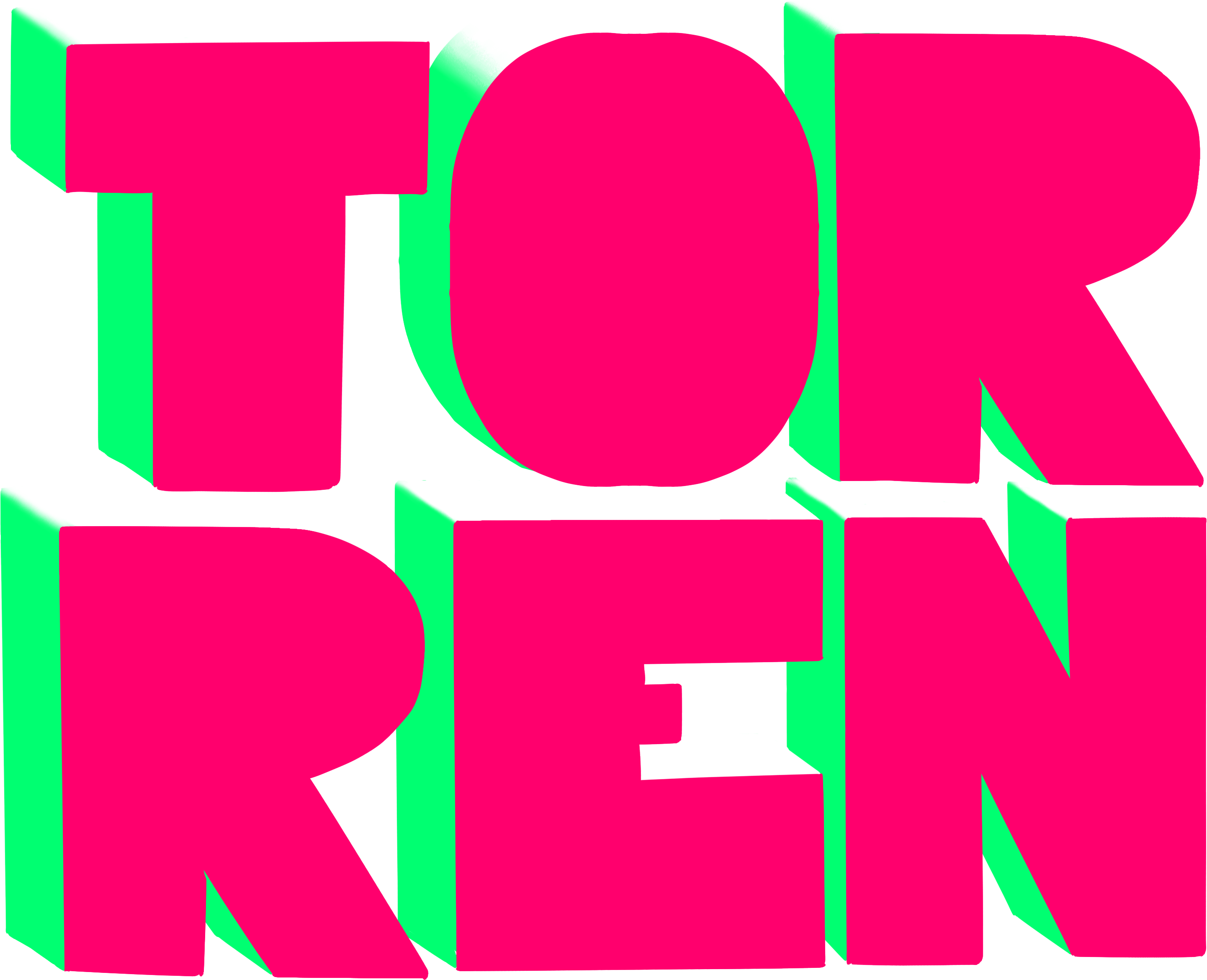


A new logo was developed in collaboration with design studio Polygon. Our creative brief asked for a design that reflected boldness, approachability, and a contemporary feel.
I nicknamed it "Lucky P"—a versatile icon that functioned as both a logo, badge, and mascot. It symbolized the company’s humanist values and digital capabilities, with the box design recalling both digital pixels, a 'plus' sign, hospitality and an "open box" ethos.
I implemented the rebrand across all media, ensuring a consistent look and feel across:
The new website was designed to reflect Proactive’s core values:
Features included:
Working with Proactive during their rebrand was a pivotal experience that demonstrated my ability to manage large-scale, multifaceted projects spanning event management, branding, media production, and digital transformation.
The rebrand was a key part of Proactive’s strategy to position itself for acquisition, enhancing its market presence and aligning its identity with long-term business goals. In 2021, Proactive’s parent company, Sirenum, was acquired by its major competitor, marking a successful conclusion to the transformation.
From orchestrating high-profile events to delivering a user-centric website, I ensured that every brand touchpoint reinforced Proactive’s values of innovation, approachability, and human connection.
By implementing creative, cohesive solutions, I elevated Proactive’s public image and equipped them with the tools to better engage clients and candidates alike.
